
App customization & commerce system
Shopify mobile app design: four decisions, and you can make them yourself.
“Fully customisable” is a sentence anybody can write. Below is what it actually means: your identity first, then three screens laid out several ways, so the app is shaped around how your catalogue sells rather than around a template.
Every section below is in the builder. Put your logo and your colours on it, assemble your home screen, and send us what you made.
-
01
Your identity
Before a single layout is chosen.
Logo, brand colours and typeface, applied across every screen. This is the step that decides whether the finished app looks like yours or like a template wearing your logo — and everything after it inherits the answer.
- Brand colours
- Typography
- Logo and app icon
- Launch screen
Aa Your palette, your typeface — set once, applied everywhere. -
02
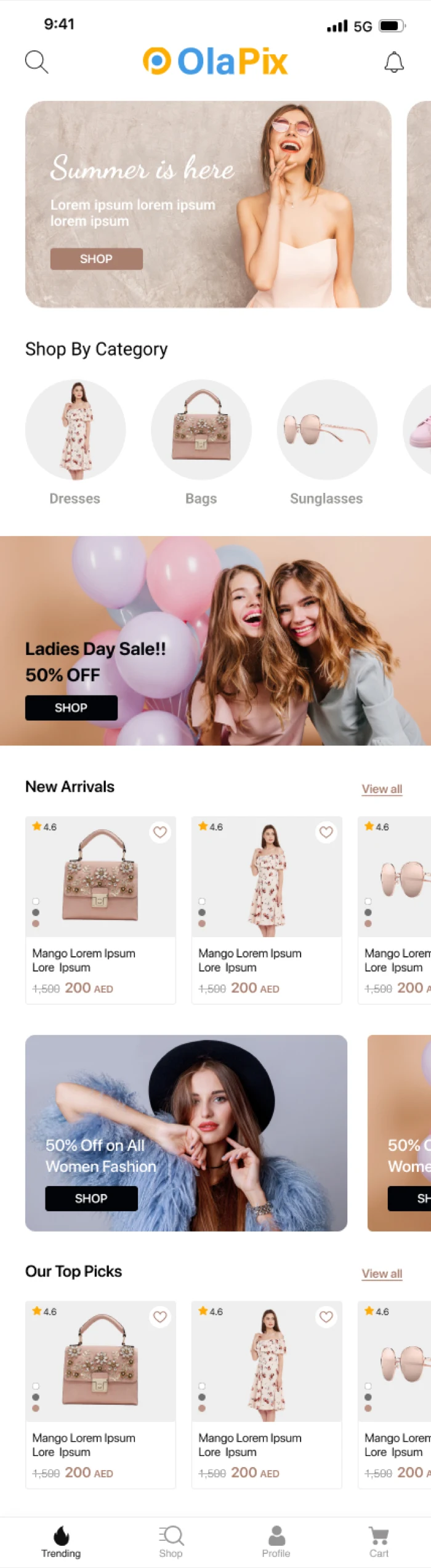
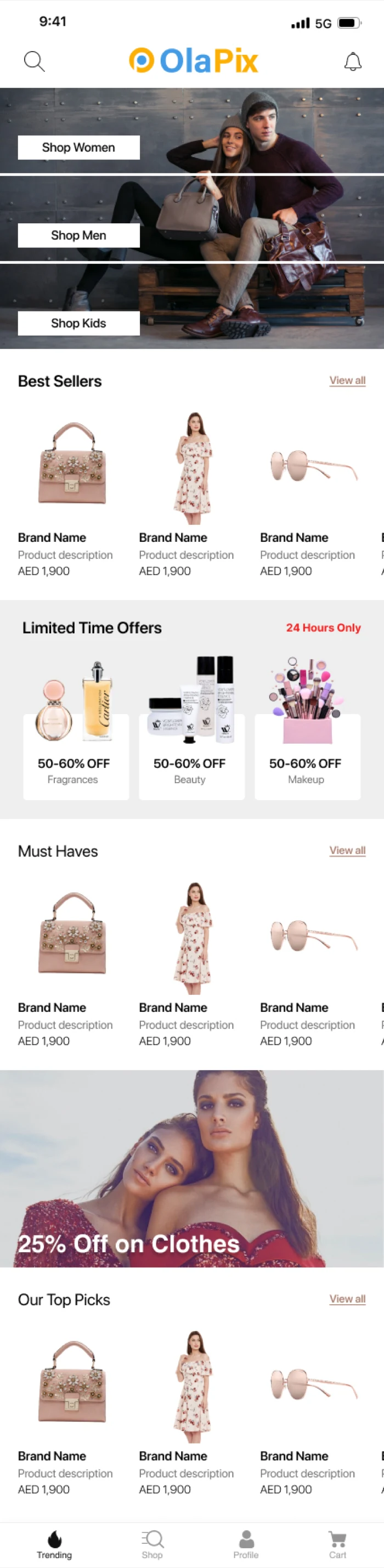
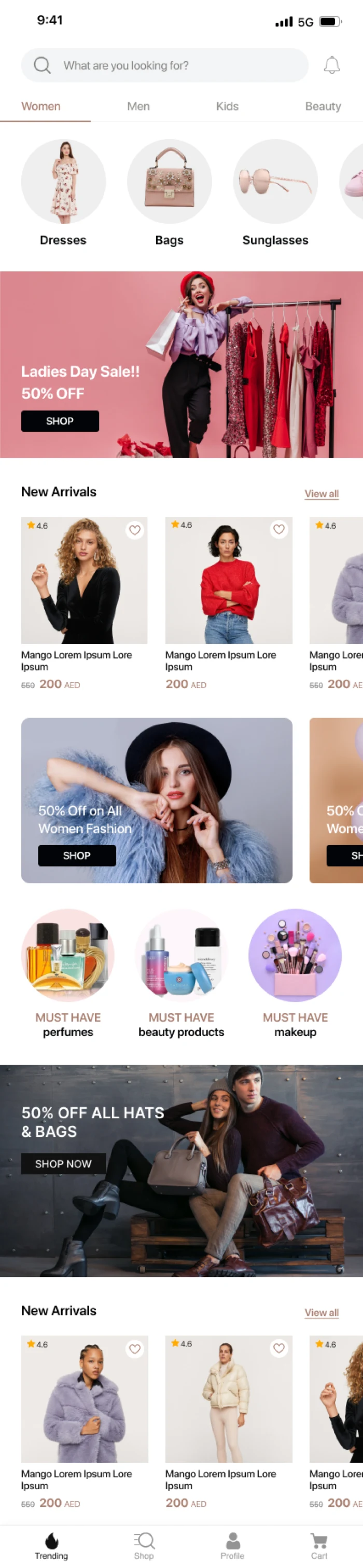
The home screen
The screen that decides whether the app gets a second open.
Four directions for the same catalogue. An editorial layout leads with one full-bleed image; a campaign layout leads with the offer; a collection layout gives each collection its own photographic card; a new-arrivals layout puts product straight under the hero. Which is right depends on whether you sell drops, seasons, collections or staples.
- Editorial
- Campaign-led
- Collection cards
- New arrivals first
Scroll the screen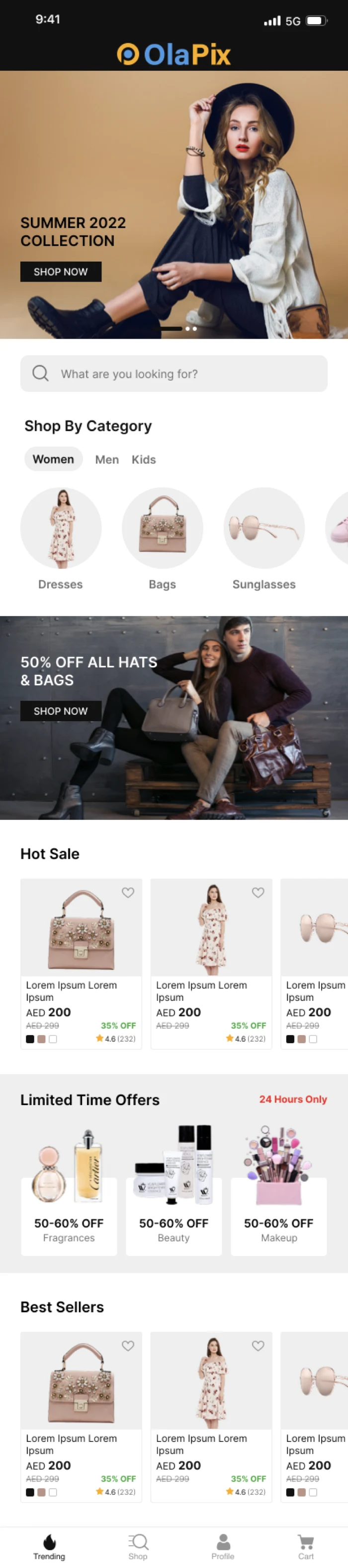
Editorial -
03
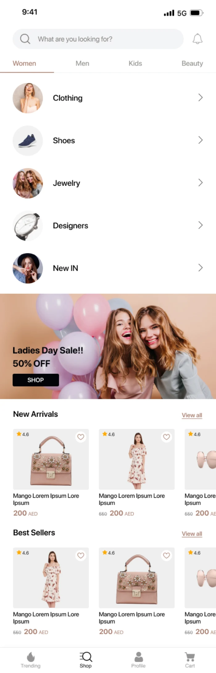
The category screens
How deep your catalogue is decides how this should look.
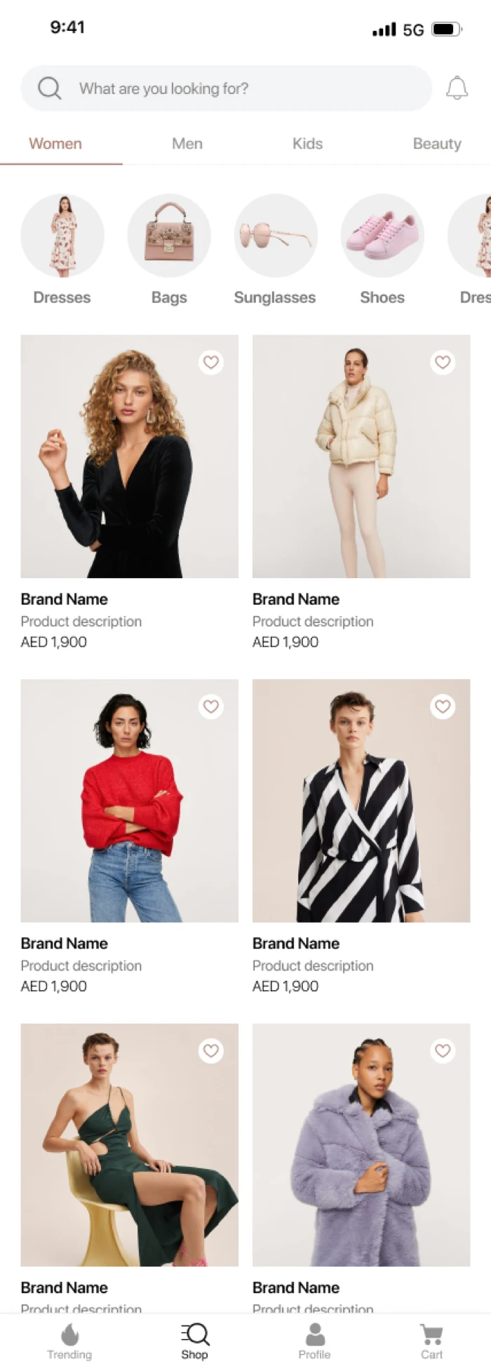
A compact list works for a store with clear departments. A two-column photographic grid works when the product sells itself on sight. A filtered listing with sort and search along the top is what a thousand SKUs actually need.
- Compact list
- Photographic grid
- Filtered listing
Scroll the screen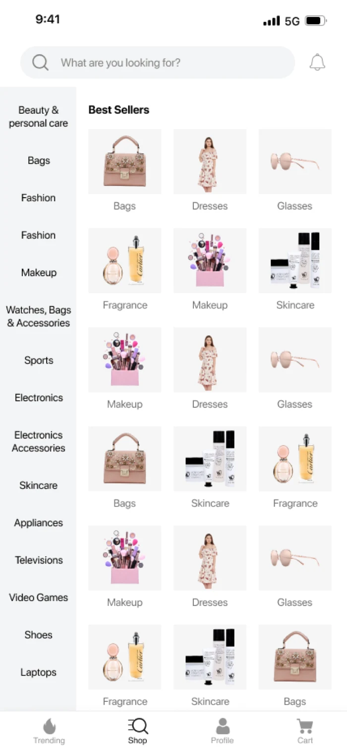
Compact list -
04
The product page
Where the sale is won, and where a wrong layout costs money.
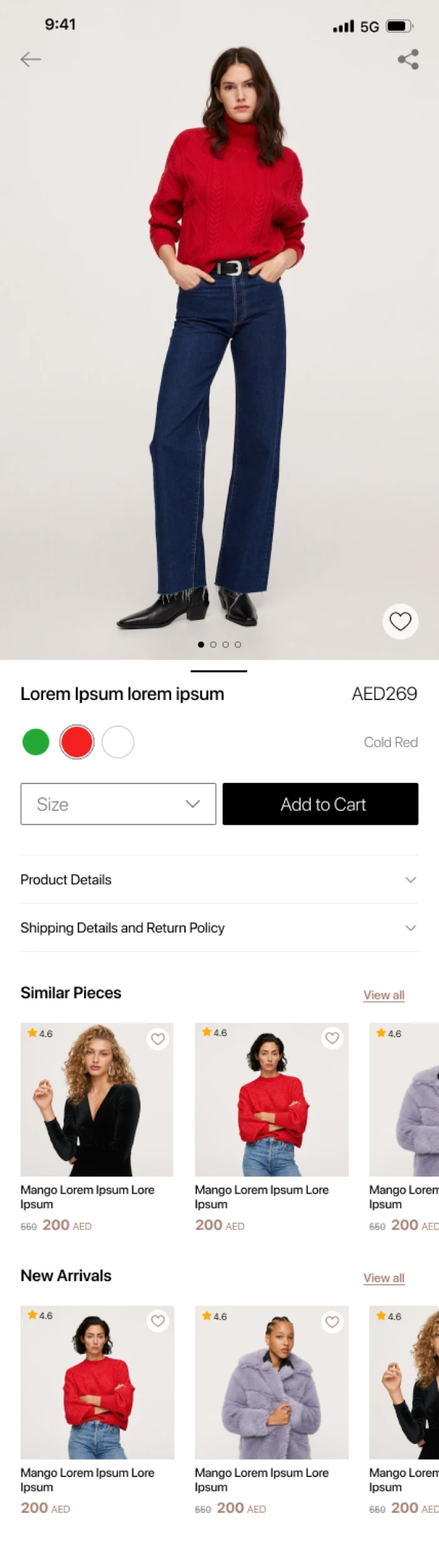
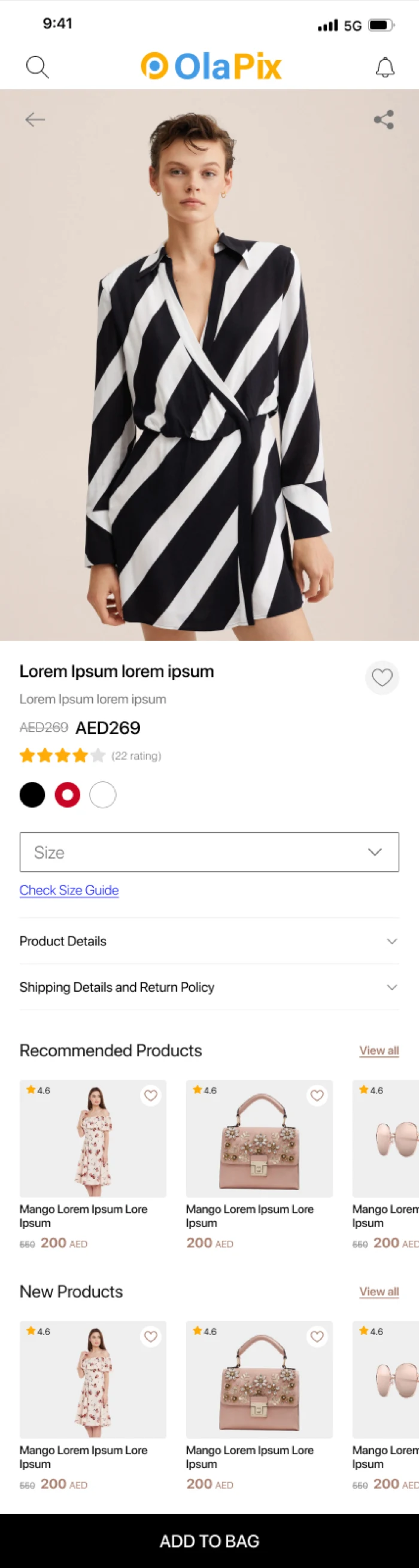
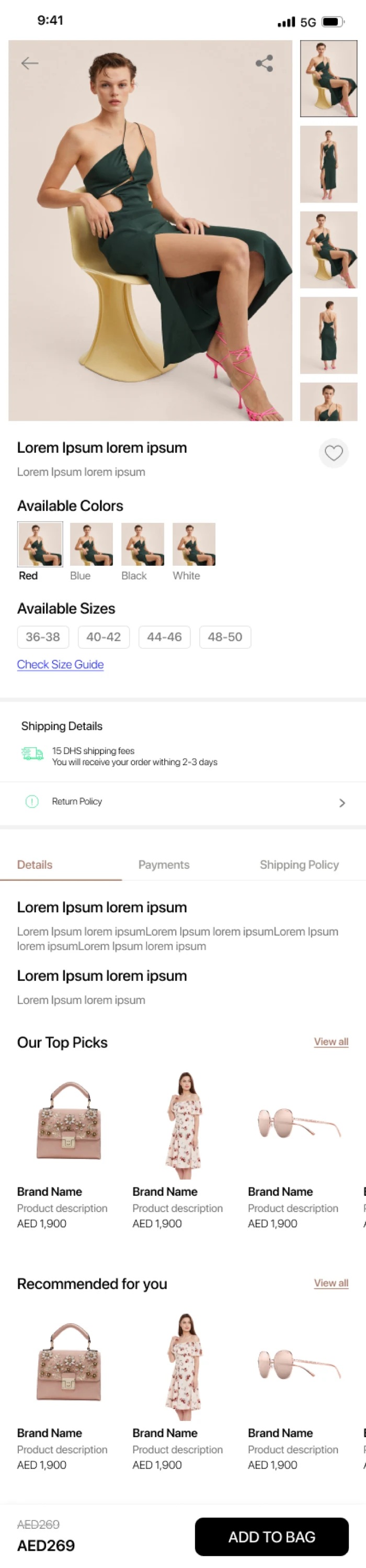
Gallery-first for fashion, where the picture is the argument. Variant-first where size and colour are the decision. Expandable detail for a considered purchase that needs delivery, returns and specification without burying the buy button.
- Gallery and price
- Variant-first
- Expandable detail
- Full-width gallery
Scroll the screen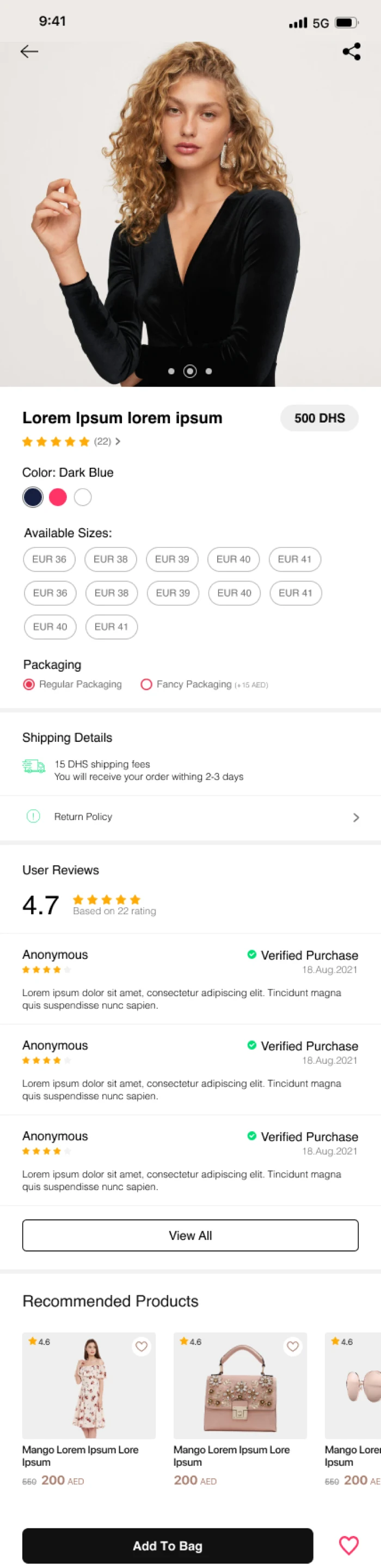
Gallery and price -
05
Bag and account
The screens nobody designs, and everybody abandons.
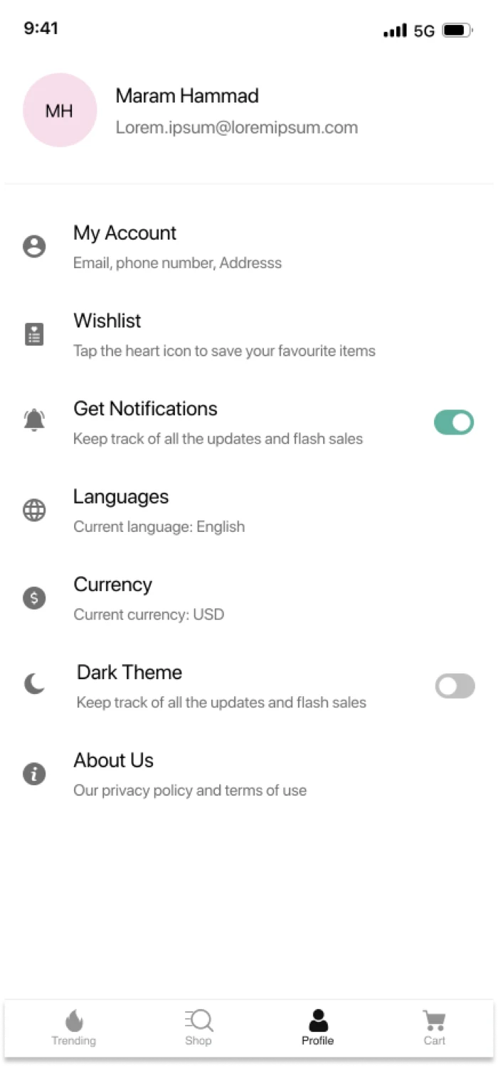
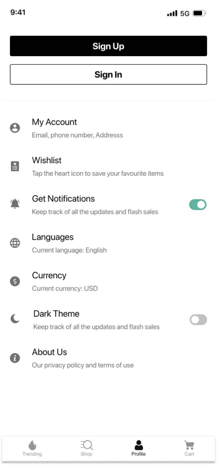
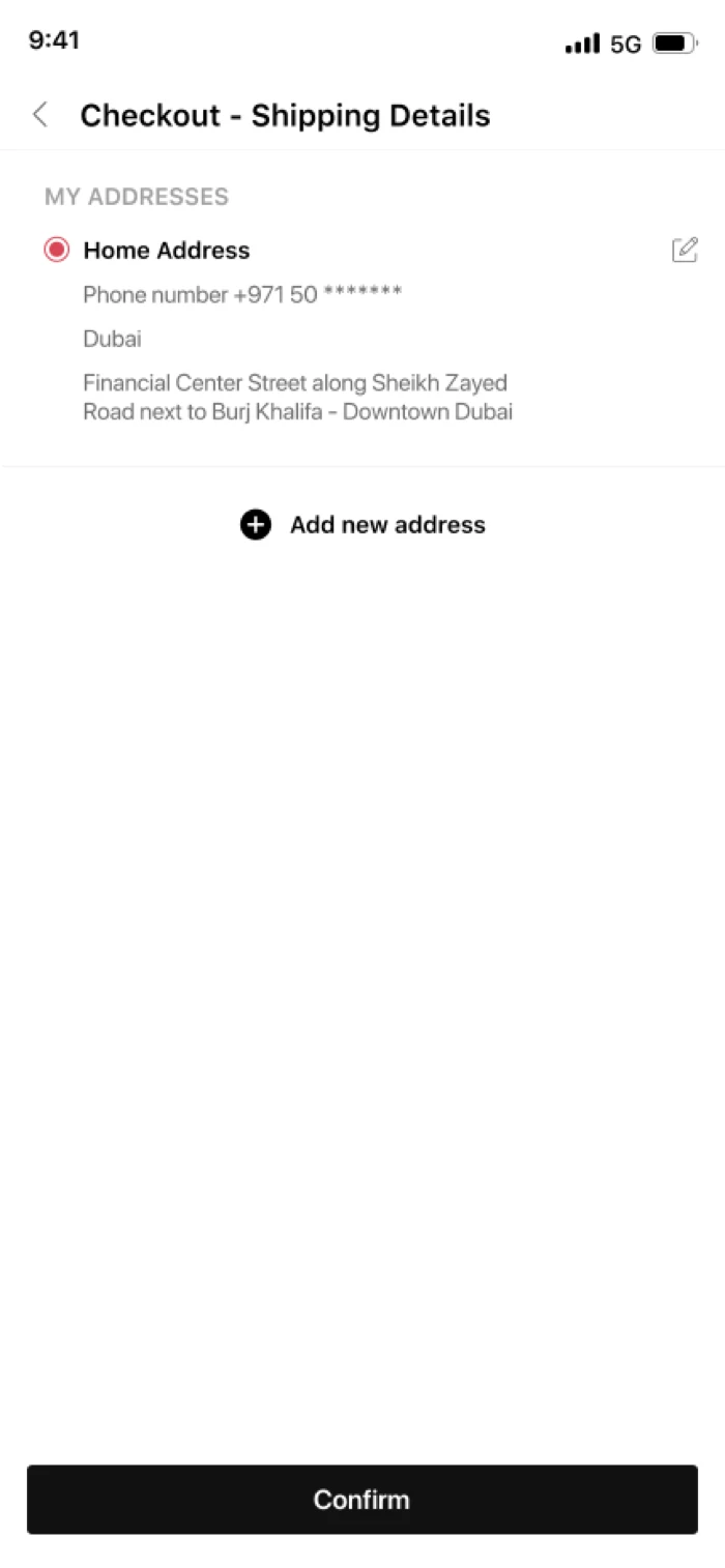
A bag that shows the free-delivery threshold before the customer gives up on it. A signed-out state that asks for the account at the right moment rather than the first. Saved addresses, so the second order is faster than the first.
- Shopping bag
- Signed in
- Signed out
- Saved addresses
Scroll the screen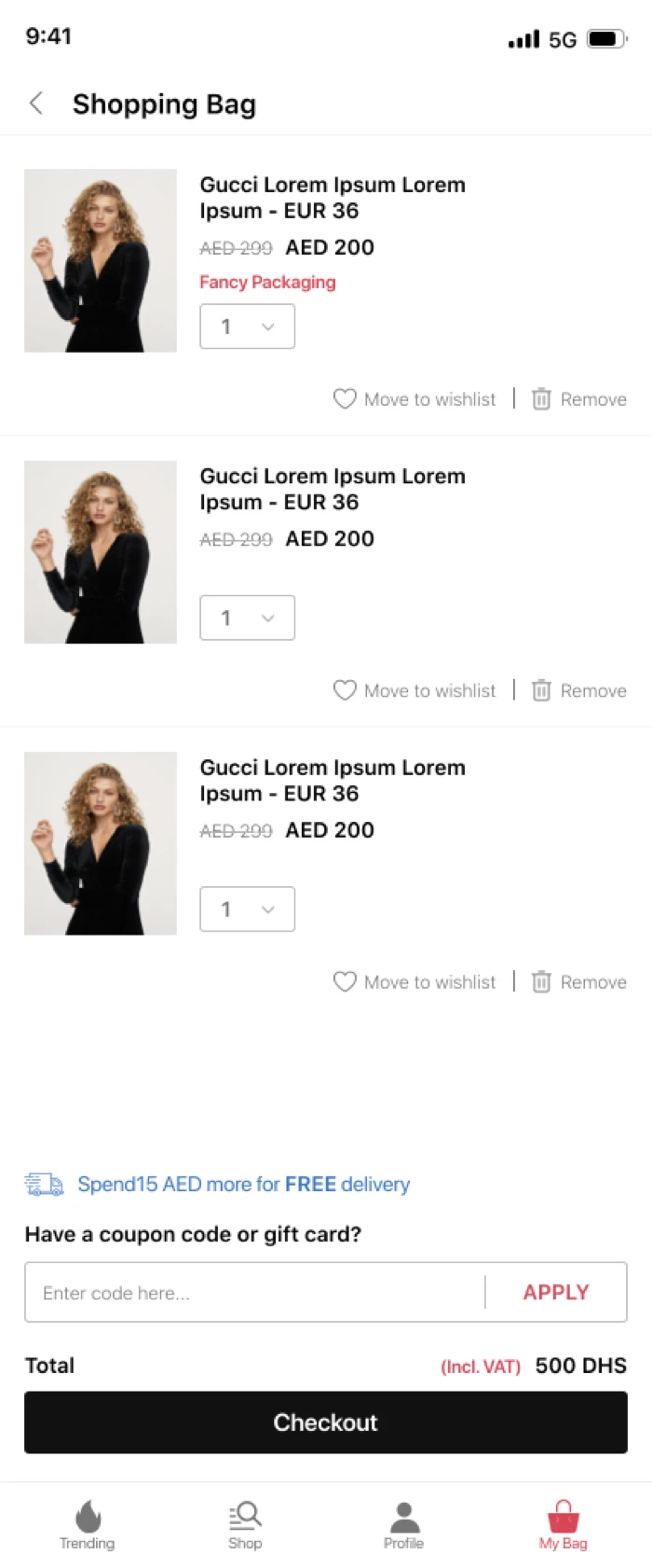
Shopping bag
And what you do not have to decide
The bag, the account screens and search come designed and built with every app. They are solved problems, they work the way your customers already expect, and there is nothing to be gained from re-inventing them — so they are not decisions we hand back to you.
What else moves
Beyond layout
The layout is the visible half. These are the rest of the decisions taken with you rather than for you.
Brand colour and type
Your palette and your typeface, applied across every screen — not your logo dropped onto somebody else's design.
Homepage sections
Which sections appear, in what order, and what each one pulls from Shopify.
Navigation
The tab bar and the menu structure your customers already understand, rebuilt for a thumb.
Language and currency
English and Arabic side by side, and AED pricing — including the layout work, not only the translation.
The commerce half
Customised on the surface. Standard underneath.
However different two TicApp builds look, they sit on the same commerce system — and that system is Shopify. Nothing about your catalogue, your orders or your checkout is reinvented to make a design work.
Design services, and what they cover
The screens are the product. This is what Shopify mobile app design services actually consist of when we quote them.
The theme, and what it is not
A Shopify mobile app theme is not your web theme. The app reads your products, never your storefront theme, so a redesign of the website leaves the app untouched — and app theme customisation is a separate decision about how the app itself looks.
Ecommerce app design, by screen
Shopify ecommerce mobile app design is four screens doing four jobs: home for returning, category for narrowing, product for deciding, bag for finishing. Designing them as one visual system and four different arguments is most of the work.
UI and UX design services
Shopify mobile app UI UX design services means the layout, the typography and the interaction — and on a phone the interaction is the larger half. Mobile ecommerce UX is decided by what is within reach of a thumb far more than by what is beautiful.
Personalisation
Shopify mobile app personalisation done honestly: the last order, saved items, and a home screen that leads with what this person actually buys. Not a recommendation engine guessing on too little history.
Right-to-left as a design decision
Arabic mirrors the layout, the icons and the reading order. Ecommerce mobile UI design for a bilingual store is two layouts from one system, decided at the start — retrofitting it costs more than building for it.
Design examples you can install
Every block in the builder is cut from a shipped app, so the Shopify mobile app design examples on this site are downloadable rather than illustrative. See the apps
Which of these is right for your catalogue?
Send us your store and we will come back with a direction, not a questionnaire.